6/19/2013
Anatomy
A N A T O M Y
After a day of intense tanning and swimming at my estate, I had a walk around the garden, and picked up a
few selections of various plants. This photo series embodies the selection of what is considered 'beautiful'
in the natural world. Something that is broken up - wilted - brown - dead, is not necessarily ugly, but can be
looked at from another point of view. For example, the torn up flower gives a somewhat peaceful, tranquil
essence. The wilted dead leaves manifests a pure end - the simple, motionless death. The series emphasises
the details within plant life and enlightens us to remember and to appreciate the beauty of every little thing.
6/11/2013
Cédric Charlier
C É D R I C C H A R L I E R
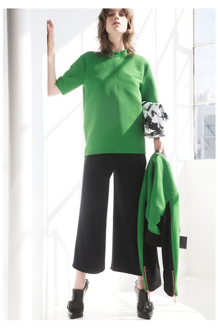
Above are images (courtesy of style.com) from Cédric Charlier's 2014 resort collection, which has been one of
my favourites this season. Charlier collection's campaign "Another Africa" clearly shows the inspiration
that derived from it. The clear cut silhouettes of these pieces are absolutely breathtaking, especially done in these
sharp bold colours. The combination of the lush green colour and the bright red is just a perfect match made
in heaven. These complimentary colours work so well together that it makes the rather monochrome collection
so much more interesting! I love the wide legged cropped black pants on photo four too! It's also great how
Charlier subtlety introduces a prints in the leatherwear, and the shoes...need I say more? The colour blocking
might be quite overdone, but i'm loving how he uses texture to neutralise that boldness. The variations of lengths
also helps to reinforce the 'another' of the campaign. In the end, my favourite photo is definitely the first B&W one,
so minimal, so simple, so effortless. In a way, it somewhat reminds me of Jil Sander and Phoebe Philo @Céline.
Will introducing subtle prints be a new take on minimalism?
Subscribe to:
Comments (Atom)


